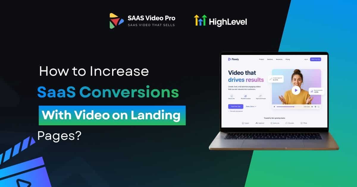
How to Increase SaaS Conversions With Video on Landing Pages?
Your landing page has one job. Turn a visitor into a customer. Most SaaS pages fail at this. Not because the product is bad. Because visitors leave before they understand what you do.
Saas explainer Video fixes this. It shows your product in seconds instead of paragraphs. In this post, you’ll learn where to place it, how to structure it, and what mistakes to avoid.
Let’s get into it.
Not sure where to start with video? That’s exactly what we do. We’ll build it, place it, and help you see real results. Book your free consultation today.
Your Landing Page Is Losing People Before They Even Scroll:
Here’s the truth. Most people don’t really read a landing page. They only check around to see if there is anything that catches their interest.
People who visit your page will read the headline and take a quick impression of the page. They make their decision to stay or go within a few seconds. This occurs more quickly than most realize.
Reading takes time. Your visitor needs to read your words, understand what you’re saying, and then visualize how your product will help them. Most people don’t want to do all that.
Video removes that effort. It shows the product instead of describing it. That’s why SaaS pages with a video on top often convert better than pages with just text and a screenshot.
It’s the difference between a visitor who “gets it” in five seconds and someone leaving without knowing what you even do.
Read this: How Much Does a SaaS Explainer Video Cost in 2026?
The Silent Reason Visitors Click Away?
Almost every SaaS founder asks the same question at some point. Why do so many visitors leave without signing up?
The answer is usually simple. Visitors leave because they didn’t understand the product fast enough, and once they get confused, they don’t stay long enough to figure it out.
A lengthy blog text, even if it’s well written, can’t give your visitor the same feeling as watching your product in video. A short video creates that feeling right away. It shows the dashboard, shows how the workflow works, and shows the exact moment your product solves the visitor’s problem, all without making them read anything.
Here’s what video really does for a landing page:
Video is not there to replace your writing. It’s there to support it with something people can actually see.
Where to Place Your Video for Maximum Conversions?
Most people don’t realize this, but placement is very important. You may have the best video in the world, but if it’s not in the right place, no one will see it.
There are actually two places to consider and both are good for different types of visitors.
Above the Fold: The Best Choice for Most SaaS Pages
Above the fold – the part of the site that is in view before visitors scroll down at all. In most cases, this is the most secure location for a SaaS landing page.
When your video is placed here, it does the explaining before your visitor even has to scroll. They don’t need to read anything or dig further to understand what you offer. The video does that work the moment the page loads.
A few reasons this spot works so well:
Below the Fold: Better for Visitors Who Already Know You
Below the fold can work too, but it depends on who’s landing on your page. This spot is better suited for warm traffic, meaning people who already have some idea of what you offer.
Think of someone clicking in from an email, or from an ad that already explained your product a little. These visitors don’t need convincing right away, so a video further down the page still gets seen and still adds value.
So Which One Should You Pick?
If you’re not sure which spot fits your page, go with above the fold. Cold traffic needs convincing fast, and a video does that better than any headline ever could.
Should video Play automatically, or Wait for a Click?
This is a smaller decision, but it still matters.
Autoplay grabs attention right away. But it comes with risk. Sound turning on without warning annoys people. It can also slow down your page if it’s not set up well.
Click-to-play waits for the visitor to choose. This shows real intent. Someone who clicks play actually wants to watch. That’s a stronger signal than someone who just happened to be on the page while a video played.
For SaaS landing pages, click-to-play is usually the smarter pick. It respects the visitor’s choice and keeps your page lighter and faster.
Don’t Let a Heavy Video Slow Down Your Whole Page:
A slow page kills conversions just as fast as bad copy does.
A few basics to get right:
How to Structure a Video That Actually Converts?
Making a video is easy. Making one that actually gets people to act is the hard part. The good news is, you don’t need a big production team for this. You just need the right structure.
Here’s a simple way to build a video that actually helps you get more signups.
Start With the Problem, Not the Product
Don’t open your video by talking about your company or your features. Open with the exact problem your visitor is dealing with right now.
Like, “You want to stop losing leads when your team forgets to follow-up?” This works because the visitor feels seen within the first few seconds. They think, “yes, that’s exactly my problem,” and that’s what keeps them watching instead of scrolling away.
Show the Product Actually Working
After naming the problem, demonstrate your product solving the problem. Don’t simply say what it can do. Show it doing it.
If a tool is capable of automatically tracking leads, display the path of the lead through the system on the screen. Watching something happen is far more convincing than hearing someone describe it. This is where the visitor begins to believe in your product, not just in your word.
Keep it brief and to the point
A good SaaS explainer video doesn’t need to be long. Typically, you should be able to make your point somewhere between 30 and 60 seconds. If it is longer, you lose people before you reach the CTA.
End With One Clear Next Step
This is where a lot of videos fail. They end with something like “learn more,” which doesn’t really tell the visitor what to do next.
Instead, give them one specific action, like:
One clear step works better than a few unclear ones. If the video ends with a clear next step, visitors know exactly what to do, so more of them actually click through.
A Simple Way to Remember This
If you want an easy way to keep this structure in mind, think of it as four small steps: Name it, Show it, Keep it short, Point them forward.
This isn’t something we just came up with either. It’s the same pattern you’ll notice in almost every SaaS explainer video that actually does well. It works because visitors need to feel understood first, then see proof it works, and then know exactly what to do next.
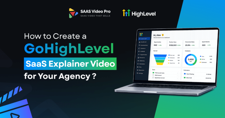
Read this: How to Create a GoHighLevel SaaS Explainer Video for Your Agency ?
Small Mistakes That Quietly Kill Your Conversions
Most video mistakes aren’t big. They’re small habits that quietly cost you signups.
Talking About Features Instead of Results
Nobody cares about a “drag-and-drop builder.” They care about saving time.
Skipping Captions
Many people watch with the sound off, especially on mobile.
Autoplay With the Sound On
This drives visitors away fast, especially on mobile.
Putting the CTA Only at the End
Not everyone watches the full video.
Fix these small habits, and your video starts doing its actual job, getting people to take the next step.
A Real time experience with LeadsFlex:
One of our clients, LeadsFlex, had a landing page that was all text and screenshots, and signups were slow.
We added a short 30-second video above the fold, right next to the headline. It showed the dashboard in action and ended with one clear CTA.
Within weeks, their conversion rate doubled.
This is the same pattern every time. Video above the fold, Click-to-play and real product on screen. One CTA doing the work. Get these right, and the video starts selling before the visitor even scrolls.
Want the same results for your landing page? Book a free consultation with us today.
Final Thought:
We’ve walked through exactly how the right video, in the right place, can lift your SaaS conversions. You don’t need to redesign your whole landing page to see results. Just start with one thing.
Add a short, clear video above the fold. Make sure it shows your real product solving a real problem. Pair it with one clean CTA.
That one change can do more for your signups than another round of rewritten copy. A video shows what words can only try to explain.
If you want to see real results in your SaaS conversions, start here. One video, placed the right way, is enough to make a real difference.
FAQs
What counts as a good conversion rate for a B2B SaaS landing page?
Most B2B SaaS pages see anywhere between 2% to 5% as a solid conversion rate. Anything above that usually means your page, offer, and traffic are working well together.
Should you hire an agency or handle landing page optimization yourself?
If you have the time and some design skill, doing it in-house can work fine for simple pages. But if conversions really matter to your growth, an agency usually gets better results faster since they’ve already tested what works.
Should your CTA say “Get Demo” or “Start Free Trial”?
It depends on your product. If your tool needs some explaining, “Get Demo” works better, but if people can start using it right away, “Start Free Trial” usually converts more.


One Comment